Interested in driving an old Range Rover to Florence and back? Here are a few facts.
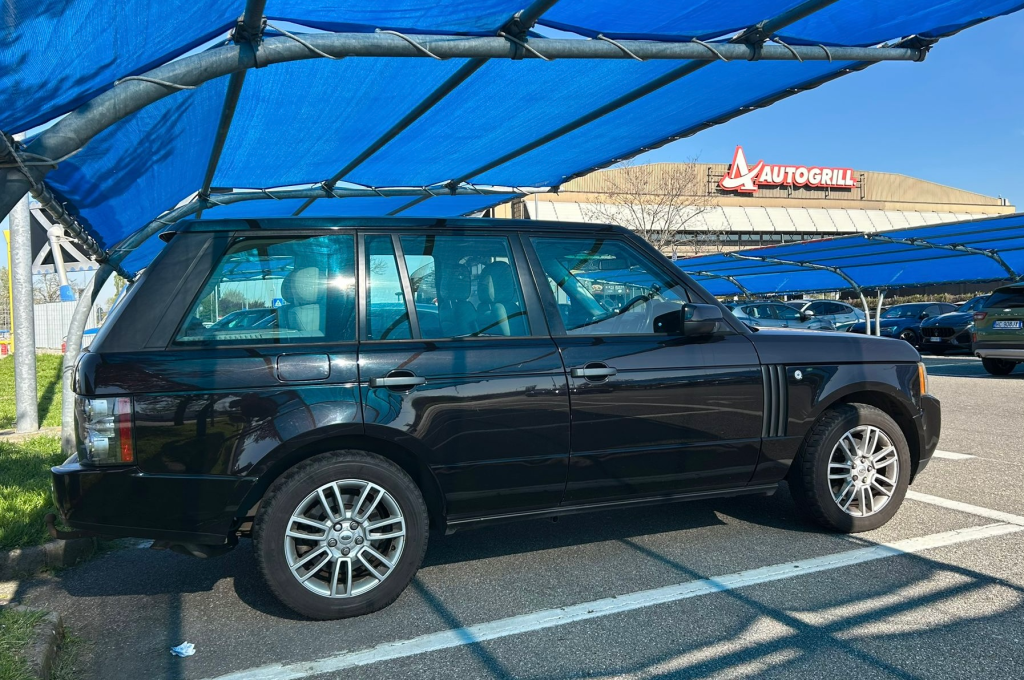
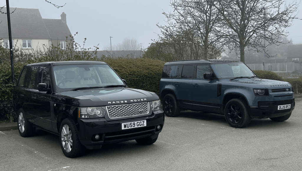
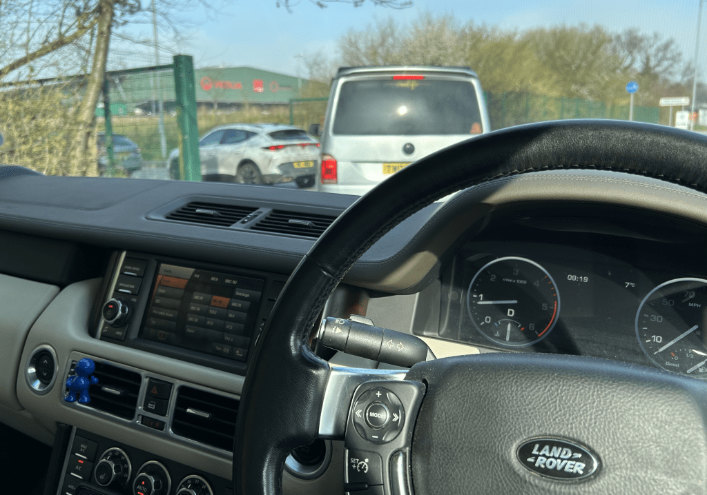
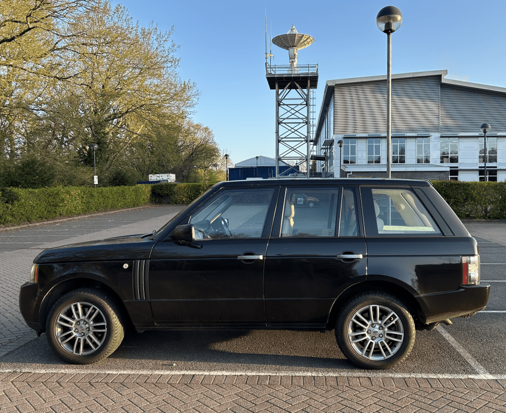
The car – A 2009 Range Rover Diesel TDV8. Pictured here safe and sound back in the office car park, Guildford. (Looks black in this light.. but it’s Bournville Brown.)
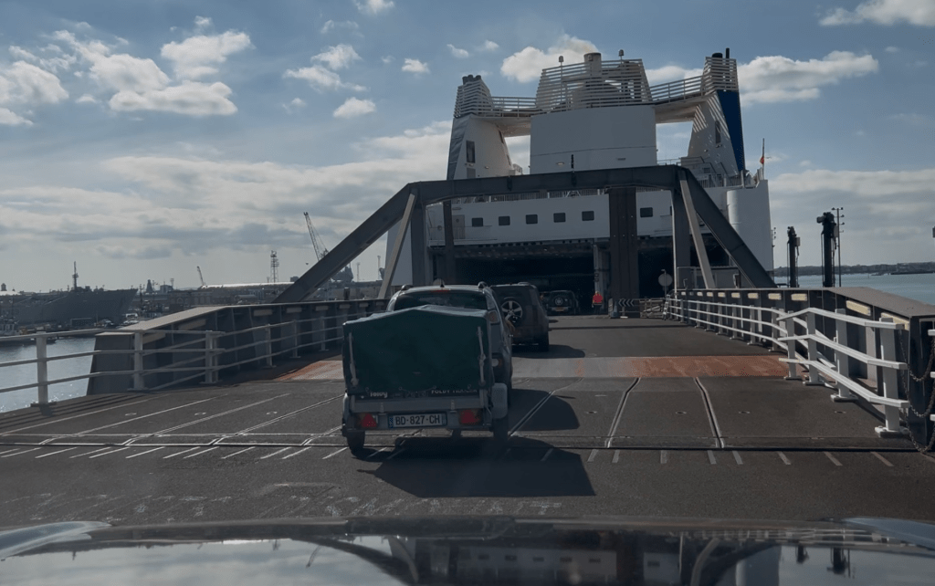
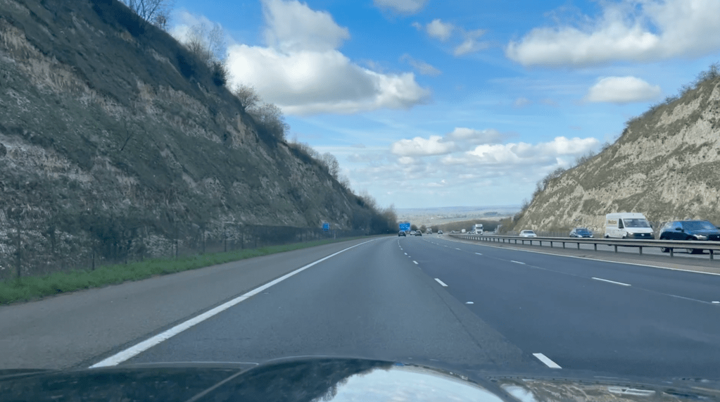
Route – Guildford to Portsmouth. Ferry to Caen. Cross the Alps through the Mont Blanc tunnel. Down Italy to Florence. Reverse on way back.
Distance – Guildford to Florence was 924 miles.. and back again was 912. Slightly longer going out due to a ‘satnav mistake’ finding my hotel in north Italy. Total 1,836 miles.
Duration – If you’re driving solo and taking things steady then two days from door to door.
Fuel economy – Just over 30mpg. Cruised at just under 70mph.
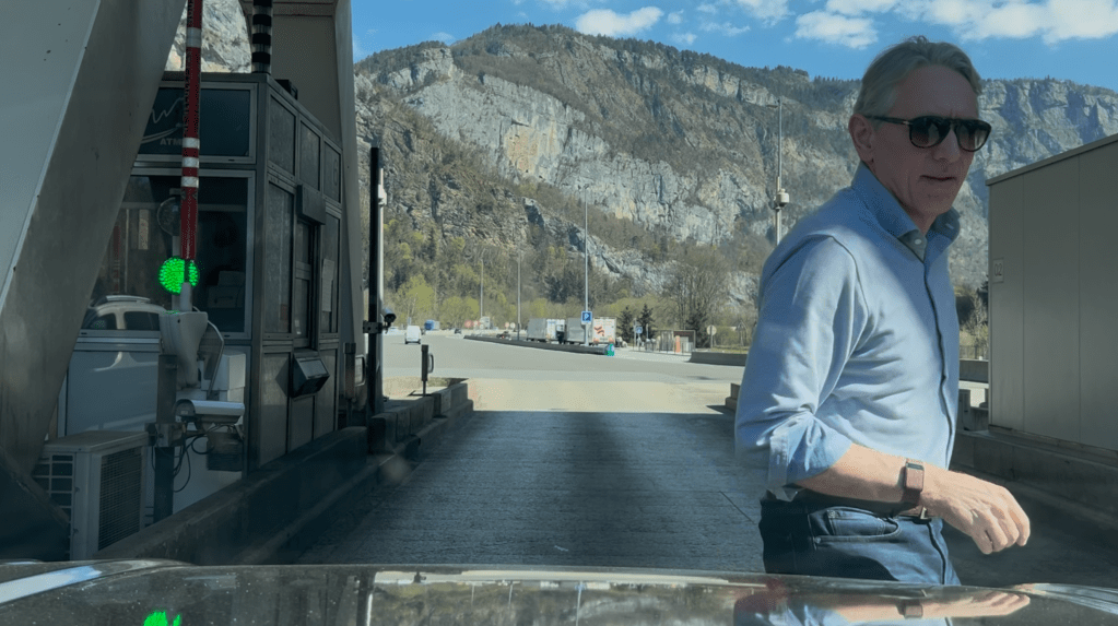
Tolls – in France 225 euros. 188 euro’s in Italy. Watch out for the ‘virtual’ tolls from Caen towards Paris – you to pay online.
Parking – Florence has a ‘Zona Scudo Verde’.. Green Shield Zone, keeping old cars out of the old centre. Had to park 5 km out of town. Only cost 15 euro’s for the week.
Overall cost – Ferry £337, Diesel £500, Tolls £360. Total £1,197. (A similar trip by air would be around £500.)
Worst road – The A1 Milan to Bologna. Flat. Straight. Endless.
Best road – The A6 in Burgundy north of Beaune… but the Valle D’Aosta down from Monte Bianco is a something else.
Car spotting – France is full of Citroens and Italy is full of Fiats. There was a mid-engined modern-ish Ferrari in rosso red with yellow brake calipers near Modena. And a lovely Alpine A110S in that light blue of theirs, somewhere deep in Burgundy.
Mechanical mishaps – None. Apart from my rear number plate coming unstuck after baking in the sunny Italian car park. No Halfords in Italy. No specialist number plate sticky pads. But I bought some ‘bio-adesivo’ strips in a hardware store, which did the job.
Don’t do it – If you want the fastest, cheapest way to get there.
Do it – If you love driving. French and Italian motorways are quieter than the UK. Get your timing right around Paris, Milan and Mont Blanc and you’ll barely touch traffic. Glorious motoring.